How Colour Psychology in Web Design Can Increase CTR & Conversions.
Have you ever found yourself feeling instantly at ease on certain websites, while others evoke a pressing sense of urgency? While content plays a role, the colours a site employs often hold the key to these reactions. Colour isn’t just to make something look good in digital marketing. It’s a powerful tool that can sway opinions, drive clicks, and boost conversions. Every pixel counts, and the right colour can make all the difference.
This influence is especially evident when considering the critical metrics of website success in both B2B and B2C sectors. Conversions, whether they manifest as contact form submissions, newsletter sign-ups, event registrations, or even the ultimate goal of product or service acquisition, are vitally important. This leads to the question of how does colour psychology in web design and digital marketing influence decisions? Beyond the foundational aspects of user interface and experience in web design, the integration of colour psychology amplifies a site’s impact. By tapping into the subconscious emotions and perceptions of users through strategic colour choices, websites can evoke the very emotions that drive sales and foster the most positive responses from visitors.
What is Colour Psychology?
At its core, colour psychology is the study of how colours influence our perceptions, emotions, and behaviours. It’s not just about what looks aesthetically pleasing; it goes deeper into the subconscious reactions evoked by different hues. Think about the calm serenity you feel when looking at a soft blue or the sudden surge of energy at the sight of a vibrant red. These aren’t mere coincidences; they’re deeply rooted psychological responses that have been studied and documented over time.
For businesses, especially in the digital realm, understanding these colour-driven nuances is paramount. In an environment where users make split-second decisions about a brand based on their website’s look and feel, the colours you choose can be the difference between a potential customer staying on your site or moving on to a competitor.
The Science Behind Colour Psychology in Web Design & Digital Marketing.
Colour is a powerful communicator that has been influencing human behaviour for centuries. The relationship between colours and our emotions isn’t a new-age concept; it’s deeply rooted in history and has been the subject of numerous studies and research.
Historical Context and Studies into Colour Psychology.
Historically, colours have held symbolic meanings in various cultures. Ancient civilizations, like the Egyptians and the Greeks, used colours for therapeutic purposes, a practice known as chromotherapy. The Egyptians, for instance, believed that certain colours could heal and incorporated them into their daily lives accordingly. Similarly, in Chinese culture, colours corresponded with specific elements and had distinct meanings and energies associated with them.
Fast forward to the modern era, and scientific studies have delved deep into the psychology of colour. Research has shown that our brain processes colours in a way that can evoke physiological reactions. For example, a study in 2006 found that warmer colours, such as red and orange, can increase arousal and excitement levels, while cooler colours like blue and green can have a calming effect.
Understanding Colour Emotions.
Different colours often evoke distinct emotions and reactions:
- Blue: Often associated with trust, calmness, and reliability. It’s no coincidence that many banks and corporate businesses use blue in their branding to convey a sense of stability and trustworthiness.
- Red: Symbolises urgency, passion, and excitement. It’s a colour that demands attention, which is why it’s frequently used in sale signs and alerts.
- Green: Represents growth, harmony, and freshness. It’s often linked to health and wellness sectors due to its calming and rejuvenating qualities.
- Yellow: Evokes feelings of happiness, optimism, and warmth. However, it’s worth noting that too much yellow can be overwhelming and lead to anxiety.
- Black: Conveys elegance, power, and sophistication. It’s a popular choice for luxury brands aiming to project an image of exclusivity.
Understanding these emotional triggers can be a game-changer for businesses online. By harnessing the power of colour psychology, brands can strategically influence how visitors perceive their brand, interact with their content, and ultimately, make purchasing decisions.
The Role of Colour in Web Design.
In the digital world, where businesses have just seconds to capture a visitor’s attention, the design and aesthetics of a website play an important role. Among the myriad of design elements, colour stands out as one of the most influential. It’s not just about making a website or page look good; it’s about conveying a message, setting a mood, and guiding user behaviour.
Setting the Tone and Mood.
Every colour carries with it an emotional weight. The hues chosen for a website can instantly set its tone and mood. A vibrant, colourful site might convey energy, innovation, and playfulness, while a monochromatic or neutral palette might evoke feelings of professionalism, elegance, and simplicity. For instance, a website for a children’s toy store might benefit from bright, playful colours, while a law firm might opt for more subdued, neutral tones to convey seriousness and trustworthiness.
The background colour, typography colour, button shades, and even the hover effects contribute to the overall user experience. They can make a website feel warm or cool, inviting or exclusive, casual or formal. It’s this emotional resonance that can keep a visitor engaged or prompt them to leave.
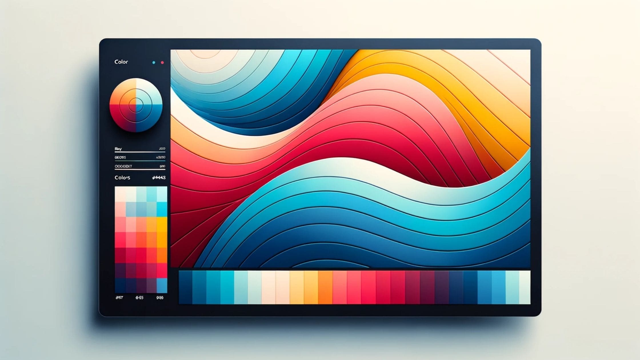
Choosing the Right Colour Palette.
Selecting the right colour palette goes beyond personal preferences. It’s a strategic decision that should align with a brand’s identity, values, and the expectations of its target audience. Here’s why it’s crucial:
- Branding Consistency: Colours play a significant role in brand recognition. Ensuring that your website’s colour palette aligns with other branding materials, like logos, business cards, and advertisements, creates a cohesive brand image.
- Resonating with the Target Audience: Different demographics and cultures might perceive colours differently. For instance, while white is often associated with purity and peace in many Western cultures, it’s linked to mourning in some Eastern cultures. Understanding your audience’s cultural background and preferences can guide more effective colour choices.
- Optimal User Experience: The right colour combinations can enhance readability, reduce eye strain, and highlight important elements on a webpage. Contrasting colours can make text pop, while complementary colours can create visual harmony.
The Central Coast Websites team prides itself on its deep understanding of colour dynamics in web design. We recognise that every hue, gradient, and shade has a purpose. By meticulously selecting and integrating colours, we ensure that websites don’t just look aesthetically pleasing but also resonate with their intended audience, driving engagement and conversions.
The role of colour in web design is both an art and a science, and its strategic implementation can significantly impact a brand’s online success.

Increased CTR Through Colour Choices.
Metrics are the lifeblood of online business success. With a vast array of analytics at the fingertips of website owners, the Click-Through Rate (CTR) emerges as a vital measure of how effectively a site engages its visitors. Interestingly, even subtle elements like the colour of a button can wield a significant impact on this crucial metric.
Introduction to CTR and Its Importance in Web Design.
CTR represents the ratio of users who click on a specific link or button to the number of total users who view the page or ad. In essence, it measures how effective a particular element is at capturing the attention and interest of visitors. In web design, a higher CTR often signifies that the design elements, including colour choices, are resonating with the audience, prompting them to take the desired action.
Case Studies on Colour's Influence on CTR.
Several studies and real-world tests have highlighted the impact of colour on CTR:
- HubSpot Test: In a well-known experiment, HubSpot tested two CTA button colours: green and red. Contrary to what one might expect, the red button outperformed the green one by a staggering 21%. This result underscores the attention-grabbing power of red in the right context.
- Dmix: Another test by Dmix showed that a simple change from a green to a red CTA button led to a 34% increase in conversions. Again, the urgency and prominence associated with red proved to be a decisive factor.
The Power of Red CTAs.
Red, in many cultures, is associated with urgency, importance, and passion. It’s a colour that naturally draws the eye. In the context of web design, a red CTA serves as a visual cue, signalling importance and prompting action. However, it’s essential to note that the effectiveness of red, or any colour for that matter, is context-dependent. While red might work wonders for a sales-driven site or a clearance sale banner, it might not be the best choice for a wellness or meditation platform.
Harnessing the power of colour psychology can be a game-changer in the digital world, turning passive visitors into active participants and customers.
When designing websites the nuances of colour choices and their impact on CTR have to be taken into consideration. Looking at the brand’s identity, the website’s purpose, and the target audience’s preferences to make informed colour decisions that drive results is paramount in the design process.
The Importance of Visual Contrast in Web Design & Digital Marketing.
Visual design is more than just selecting appealing colours; it’s about creating a visual hierarchy that guides the viewer’s eye and attention. Central to this hierarchy is the principle of visual contrast, a design element that can significantly influence user engagement and actions on a website.
Explanation of Visual Contrast and Its Role.
Visual contrast refers to the difference in appearance between two design elements, be it colour, size, shape, or texture. This difference makes certain elements stand out, allowing them to capture and guide the user’s attention. In web design, contrast is used to highlight important information, create focal points, and guide users through a site’s content and actions seamlessly.
Contrasting CTAs and Their Power to Attract Attention.
One of the most common applications of visual contrast in web design is in the design of Call-to-Action (CTA) buttons. By making a CTA button contrast sharply with its surroundings, it naturally draws the eye. For instance, a bright orange CTA on a muted grey background will immediately stand out, signalling its importance and prompting users to click.
This doesn’t mean that the most contrasting colour is always the best choice. The contrast should align with the website’s overall design and branding while ensuring the CTA remains the focal point.
Achieving the Right Balance.
While contrast is essential, it’s crucial to strike the right balance. Overwhelming contrast can be jarring and can distract from the content, while too little contrast can make important elements go unnoticed.
Here are some tips to achieve a harmonious balance:
- Consistency is Key: Ensure that CTAs and other essential elements maintain consistent contrast throughout the site for a cohesive user experience.
- Test and Iterate: Use A/B testing to try out different contrast levels and see which one resonates most with your audience.
- Consider Readability: Ensure that text contrasts well against its background, making it easy to read and understand.
- Avoid Overloading: Too many contrasting elements can confuse and overwhelm users. Prioritise which elements need to stand out and use contrast sparingly.
Central Coast Websites employs a meticulous approach to visual contrast, ensuring that every design choice is both aesthetically pleasing and functionally effective. By understanding and harnessing the power of contrast, we create web experiences that are intuitive, engaging, and conversion-driven.
Visual contrast, when used judiciously, can elevate a website’s design from good to exceptional, guiding users effortlessly towards the desired action.
Colour Accessibility in Web Design.
In the pursuit of creating visually stunning websites, it’s essential not to overlook a crucial aspect of design: accessibility. As web designers and developers, our responsibility extends beyond aesthetics; we must ensure that our creations are inclusive and accessible to all, including those with colour blindness and other visual impairments.
Designing for Colour Blindness and Visual Impairments.
Colour blindness, or colour vision deficiency, affects a significant portion of the population. It’s a condition where individuals perceive colours differently or not at all. Designing without considering this can lead to essential information being missed or misunderstood.
For instance, relying solely on colour to convey information (like red for errors and green for success) can be problematic. Those with colour blindness might not discern the difference, leading to confusion or incorrect actions.
Beyond colour blindness, there are other visual impairments, such as low vision or complete blindness, which further emphasise the need for accessible design. This means ensuring that websites are not just visually appealing but also navigable and understandable for everyone.
Tools and Strategies for Colour Accessibility.
Thankfully, there are tools and strategies available to help designers create more accessible websites:
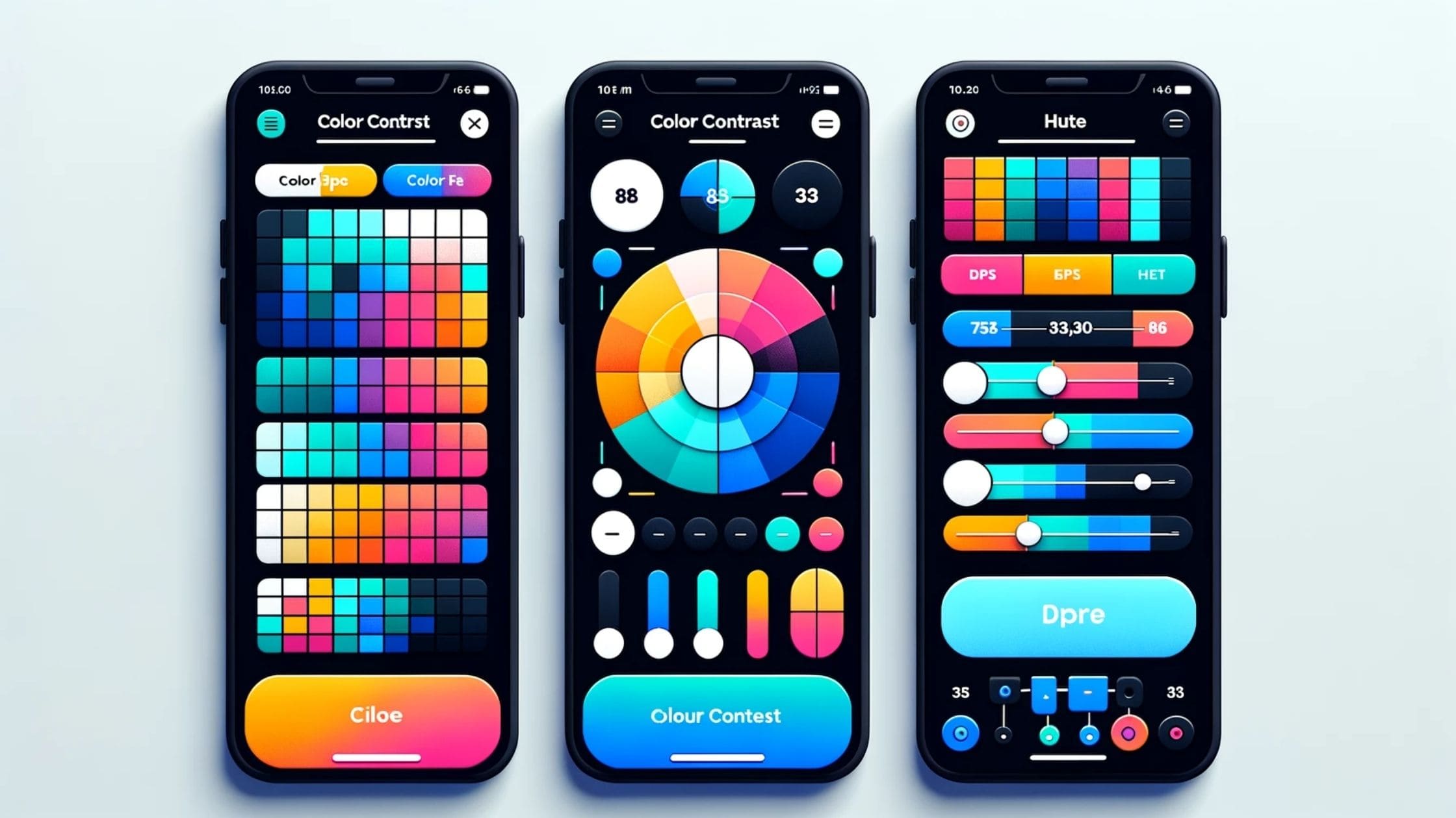
- Colour Contrast Checkers: Tools like the WebAIM Contrast Checker allow designers to test the contrast between background and foreground colours, ensuring that text is readable for everyone, including those with low vision.
- Simulators: There are tools available that simulate how a website looks to those with different types of colour blindness. This can be invaluable in understanding and designing for these perspectives.
- Alternative Indicators: Instead of relying solely on colour, use symbols, patterns, or text to convey information. For example, instead of just colour-coding form input errors, also include an error icon or descriptive text.
- WCAG Guidelines: The Web Content Accessibility Guidelines (WCAG) provide a wealth of information on creating accessible web content. Following these guidelines can help ensure your website is accessible to a broader audience.
In the digital age, where websites serve as primary touchpoints for businesses and organisations, ensuring colour accessibility is not just a best practice—it’s a moral imperative. It’s essential to recognise that everyone, irrespective of their visual abilities, deserves a seamless and enjoyable online experience. By prioritising colour accessibility in the design process, we can create websites that are not only aesthetically pleasing but also universally accessible to all.
Best Practices for Implementing Colour Psychology.
Harnessing the power of colour psychology in web design can be transformative, but it’s essential to approach it with a strategic mindset. The colours chosen can either elevate the user experience or detract from it. To ensure that colour choices enhance a website’s effectiveness and appeal, here are some best practices to consider:
Choosing the Right Colour Palette
Understand Your Audience: Different demographics and cultures may have varying perceptions and preferences when it comes to colour. Research your target audience to understand which colours resonate most with them.
Align with Brand Identity: Your website’s colour palette should be in harmony with your brand’s existing colours, logos, and overall identity. This not only ensures consistency but also reinforces brand recognition.
Consider Emotions and Associations: Remember the emotional cues different colours can evoke. For instance, while blue might convey trust and calm, orange can signify excitement and enthusiasm.
Consistency Across Web Pages
Maintain a Uniform Look: Once you’ve chosen a colour palette, stick to it across all web pages. This creates a cohesive user experience and makes navigation more intuitive.
Standardise CTAs: If you’re using a specific colour for call-to-action buttons on one page, maintain that colour across all CTAs on your site to avoid confusion.
Use a Style Guide: Developing a style guide can be invaluable. It ensures that everyone involved in the website’s design and updates adheres to the same colour standards.
Avoiding Pitfalls in Colour Selection
- Beware of Trend Overload: While it’s tempting to jump on the latest colour trends, it’s essential to choose a palette that has longevity and aligns with your brand’s message.
- Ensure Readability: Always test colour combinations for text and background to ensure that content is easily readable. High contrast combinations are usually the most legible.
- Test and Iterate: Just because a colour works well for one brand doesn’t mean it will work for another. Use A/B testing to see how different colour choices impact user engagement and conversion rates.
Implementing colour psychology in web design is both an art and a science. By following these best practices, businesses can create websites that not only look good but also connect with their audience on a deeper, more emotional level.
The Transformative Impact of Colour in Digital Spaces.
The psychology of colour in web design has a significant impact on user behaviour. Key takeaways include:
- Colour is Powerful: Beyond mere aesthetics, colours evoke emotions, influence perceptions, and drive actions. They play a pivotal role in determining a website’s effectiveness and user engagement.
- Accessibility Matters: In our quest for the perfect palette, it’s crucial to ensure that websites are accessible to all, including those with colour blindness and other visual impairments.
- Consistency is Key: Maintaining a consistent colour palette across a website not only enhances its visual appeal but also provides a more intuitive and cohesive user experience.
- Strategic Choices: The strategic use of colour, especially in elements like CTAs, can significantly boost metrics like CTR, underscoring the importance of informed colour decisions.
Understanding colour theory is like unlocking a secret code. It’s a powerful tool that can help you communicate effectively with your audience. By using colour strategically, you can create designs that not only look great but also evoke strong emotions and drive action.
So, let your imagination run wild and bring your designs to life with vibrant, engaging colours!