
Key Colour Theory Terms You Should Know.
In the dynamic world of business, where every touchpoint with your audience matters, the visual appeal of your online presence can be a game-changer. While many factors contribute to a website’s success, one element often remains under the radar, yet holds immense sway: colour. As a business owner or decision-maker, understanding the nuances of colour theory can be the key to unlocking the full potential of your website, influencing user behaviour, and driving conversions.
If you’ve explored our previous insights on colour psychology in web design, you’re already aware of the profound impact colour can have. Building on that foundation, this guide aims to provide you with a deeper understanding of colour theory, tailored specifically for businesses looking to make informed decisions about their online presence.
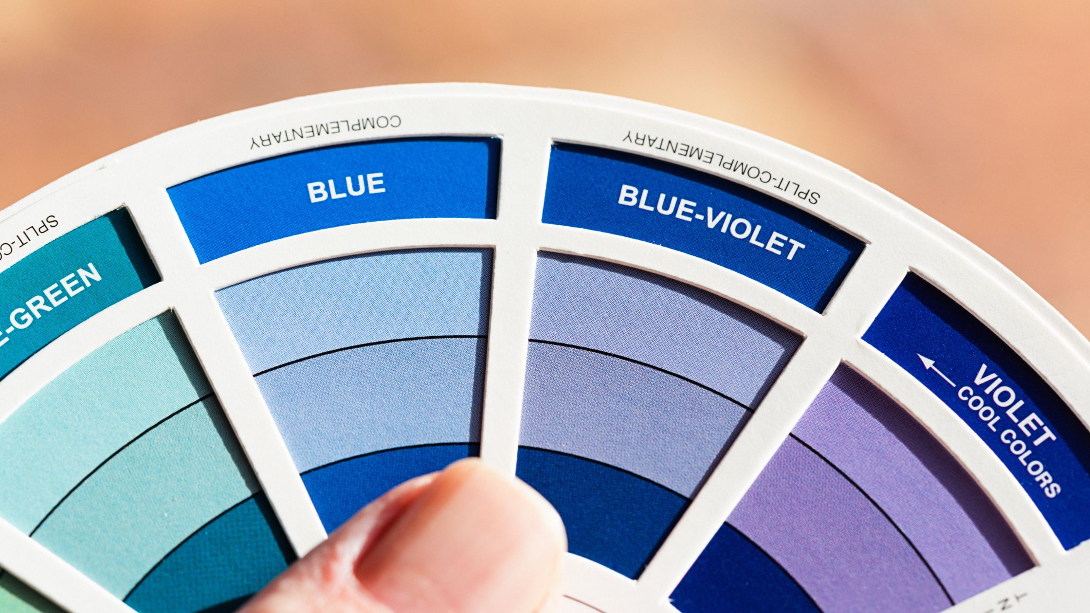
The Colour Wheel- Your Palette of Possibilities
The colour wheel is a fundamental tool in the world of design, acting as a visual representation of the relationships between primary, secondary, and tertiary colours. Originating from Sir Isaac Newton’s colour circle in 1666, this wheel has evolved over centuries, becoming an indispensable guide for artists, designers, and marketers alike.
At its core, the colour wheel is divided into three categories:
- Primary Colours: These are the foundational colours from which all other colours are derived. They include red, blue, and yellow.
- Secondary Colours: Created by mixing two primary colours in equal measure. This results in green (blue + yellow), orange (red + yellow), and purple (red + blue).
- Tertiary Colours: These are the outcomes of mixing a primary colour with a secondary colour, leading to shades like red-orange or blue-green.
Understanding the colour wheel’s structure allows businesses to make informed decisions about colour combinations. For instance, adjacent colours can create harmonious designs, while opposites can offer striking contrasts.
For businesses aiming to establish a strong online presence, the colour wheel is more than just a design tool; it’s a strategic asset. By selecting colours that align with your brand’s values and message, you can evoke specific emotions in your audience, guiding their perceptions and actions. Whether you’re aiming for trustworthiness, excitement, calm, or passion, the colour wheel holds the keys to crafting the perfect visual narrative for your brand.
Colour Relationships- Crafting Cohesion and Contrast
In design, understanding colour relationships is pivotal. It’s not just about choosing colours that look good together; it’s about selecting combinations that evoke the right emotions, guide user behaviour, and align with your brand’s ethos. By strategically selecting and combining colours, brands can guide user attention, evoke desired emotions, and ultimately drive desired actions, be it a purchase, sign-up, or any other conversion goal.
Let’s look into some of the most common colour relationships and how they can be harnessed effectively for your business:
Monochrome: A monochromatic colour scheme is both elegant and straightforward. By focusing on a single hue and exploring its various tints, shades, and saturations, businesses can craft a design that exudes consistency and sophistication. This approach is particularly effective for brands that want to emphasise a particular emotion or value associated with a colour. For instance, a tech company might opt for varying shades of blue to convey trust and reliability.
Complementary: As the name suggests, complementary colours sit opposite each other on the colour wheel. When paired, they create a striking contrast that’s hard to miss. This vibrant juxtaposition can be a powerful tool for brands aiming to stand out and make a memorable impression. For instance, a health brand might use green and red to highlight natural ingredients against potential allergens.
Analogous: An analogous colour scheme involves selecting hues that sit side by side on the colour wheel. This creates a harmonious and cohesive look, perfect for brands aiming for a more understated elegance. Such a scheme can evoke feelings of calm and balance, making it ideal for wellness or luxury brands.
Triadic: For those looking to inject a bit more vibrancy into their design without going overboard, a triadic colour scheme is the answer. By selecting three colours that are evenly spaced on the wheel, brands can achieve a balanced yet colourful look. This approach offers diversity and can be used to highlight different aspects or products of a business without seeming disjointed.
Colour Warmth - Setting the Mood

The emotional resonance of colours extends far beyond their visual appeal. At the heart of this emotional connection lies the concept of colour warmth. By understanding the temperature of colours, businesses can craft a digital environment that aligns perfectly with their brand’s ethos and the emotions they wish to evoke in their audience.
Warm Colours
Think of the radiant hues of a sunset or the fiery tones of autumn leaves. Warm colours, encompassing shades of red, orange, and yellow, are often associated with energy, enthusiasm, and passion. They have the power to stimulate and invigorate, making them ideal for brands that want to convey excitement, creativity, or boldness. For instance, a startup launching an innovative product might lean towards these colours to highlight their groundbreaking approach.
Cool Colours
Evoking the serenity of a clear sky or the tranquillity of a deep ocean, cool colours like blue, green, and purple often convey feelings of calm, trust, and reliability. They provide a sense of stability and can be particularly effective for businesses in sectors like finance, healthcare, or technology, where trust and dependability are paramount.
Perception of Warmth & Coolness
It’s worth noting that the perception of warmth or coolness can also be influenced by cultural and individual factors. However, the general principles remain consistent across the board. By strategically choosing between warm and cool palettes, businesses can set the tone for their website, ensuring that visitors not only understand the brand’s message but also feel it on a deeper, emotional level.
Colour Systems-Ensuring Consistency Across Platforms
Consistency is paramount in the world of design and branding. It’s not just about having a memorable logo or a catchy tagline; it’s about ensuring that every touchpoint with your audience, be it digital or print, resonates with the same brand essence. One of the key pillars of this consistency is colour. However, the way colours are represented and produced can vary significantly across different platforms and mediums. Enter colour systems.
- RGB (Red, Green, Blue): This system is primarily used for digital displays, such as computer monitors, TVs, and smartphones. RGB works on the principle of additive colour mixing, where different levels of red, green, and blue light are combined to produce various colours. When designing for digital platforms, ensuring your colours are optimised for RGB will guarantee they appear vibrant and true-to-brand.
- CMYK (Cyan, Magenta, Yellow, Black): If you’re venturing into the world of print, be it business cards, brochures, or billboards, CMYK is the system to know. Unlike RGB, CMYK works on the principle of subtractive colour mixing. Here, different percentages of cyan, magenta, yellow, and black inks are combined to produce a wide range of colours. Ensuring your brand colours are CMYK-compatible will guarantee they print accurately and consistently.
- HEX (Hexadecimal Colour): Predominantly used in web design and development, HEX codes are a way of representing RGB colours in a base-16 format. Each HEX code corresponds to a specific RGB combination, ensuring precise colour representation on websites. For instance, the HEX code #FFFFFF represents white, while #000000 denotes black.
Understanding and effectively leveraging these colour systems is crucial for any brand aiming for a cohesive and consistent presence across various platforms. It’s not just about aesthetics; it’s about building trust. When customers see the same brand colours, whether they’re browsing your website or holding a printed brochure, it reinforces brand recognition and fosters a sense of reliability.
Tints, Shades, and More - The Subtleties of Colour
While the broader strokes of colour theory provide a foundational understanding, the true artistry and precision in design come from mastering the subtler aspects of colour. These nuances, often overlooked, can be the difference between a design that’s ‘almost right’ and one that perfectly encapsulates your brand’s essence.
- Hue: At its simplest, hue refers to the pure spectrum of colours without any alterations. It’s what we commonly refer to when we say “colour.” Whether it’s red, blue, yellow, or any point in between, each represents a different hue. Understanding hues is the starting point for any colour exploration, setting the stage for further refinements.
- Saturation: Think of saturation as the intensity or purity of a colour. A hue with high saturation will appear bold and vivid, while one with low saturation will seem muted or washed out. Adjusting saturation can help brands convey different moods; for instance, a muted palette might evoke feelings of nostalgia or vintage charm, while a highly saturated one could signify modernity and energy.
- Lightness: Often confused with brightness, lightness refers to the amount of white or black added to a hue. Adding white creates a tint (lighter version) of the original colour, while adding black results in a shade (darker version). Playing with tints and shades allows brands to explore variations of their primary colours, offering flexibility while maintaining brand consistency.
Navigating the complexities of hue, saturation, and lightness empowers brands to craft a colour palette that’s not just visually appealing but also deeply resonant. It’s about finding that perfect shade that aligns with your brand’s voice, message, and ethos. In the world of design, where every choice communicates a message, understanding these subtleties ensures your brand’s narrative is told precisely as you envision it.
The Power of Contrast.
In the visual symphony of a website, contrast acts as the conductor, orchestrating where the audience’s attention should go and ensuring harmony between all elements. It’s a design principle that, when used effectively, can elevate the user experience from ordinary to exceptional.
- Clarity and Readability: One of the primary roles of contrast is to ensure content is easily readable. A well-contrasted text against its background ensures that visitors can effortlessly consume the information, reducing strain and enhancing user experience. For instance, black text on a white background is a classic example of high contrast that promotes readability.
- Emphasis and Hierarchy: Contrast can be used to draw attention to specific elements on a page. Whether it’s a headline, a special offer, or a testimonial, adjusting contrast can make certain sections pop, guiding visitors’ eyes to what’s most important. This becomes especially crucial for elements like Call-to-Action (CTA) buttons, where a higher contrast can lead to better visibility and, consequently, higher click-through rates.
- Guiding User Navigation: Beyond text and CTAs, contrast can also play a pivotal role in user navigation. By differentiating between different sections or elements of a page, contrast can guide users on a seamless journey through your content, ensuring they engage with each segment as intended.
- Evoking Emotion: On a subtler level, contrast can also be used to evoke specific emotions or set the mood. A stark contrast might convey drama and excitement, while a more muted contrast could evoke calmness and tranquillity.
Harnessing the power of contrast is about more than just aesthetics; it’s a strategic tool that can significantly impact user engagement and conversion. By understanding and implementing effective contrast, businesses can ensure that their website not only captures attention but also guides visitors towards desired actions, be it signing up for a newsletter, downloading a resource, or making a purchase.
The Strategic Significance of Colour.
In the vast digital landscape, where countless brands vie for attention, the strategic use of colour emerges as a distinguishing factor when thinking of your business branding. It’s not merely about beautifying a webpage; it’s about communicating, connecting, and compelling. Each hue, shade, and tint carries with it a story, an emotion, and a call to action.
As we’ve journeyed through the intricacies of colour theory, from the foundational colour wheel to the subtle power of contrast, one thing becomes abundantly clear: colour is a language. And like any language, mastering it can open doors to deeper connections and more meaningful interactions.
As you partner with Central Coast Websites on your web development journey, armed with this newfound knowledge, you’re not just choosing colours. You’re making informed decisions that will echo the ethos of your brand, resonate with your audience, and pave the way for your business’s success in the digital space.
Here’s to crafting digital experiences that are not just visually stunning but also strategically sound, ensuring that every pixel, every hue, and every gradient works in harmony to tell your brand’s unique story.