
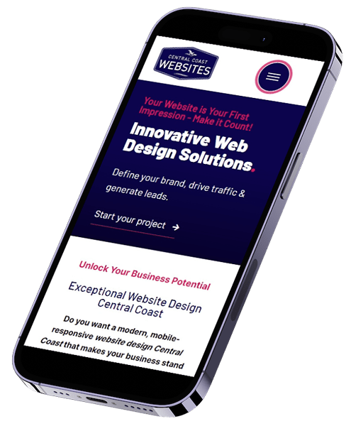
Responsive Web Design Central Coast.
Our team specialises in responsive web design on the Central Coast, ensuring your website looks and functions perfectly on every device. In today’s online business world, where users access websites from smartphones, tablets, and desktops, having a mobile-responsive site is a necessity. Responsive web design guarantees a consistent and user-friendly experience across all screen sizes, keeping your audience engaged no matter how they visit your site. This adaptability not only enhances user experience but also improves your site’s visibility in search engines, making it an essential component for any successful business.
What is Responsive Web Design?
Responsive website design is an approach to web development that ensures your website automatically adjusts its layout and content based on the device being used. Whether a visitor is viewing your site on a desktop, tablet, or smartphone, the design responds to the screen size, providing an optimal viewing experience.
This means images resize correctly, text remains readable without excessive scrolling or zooming, and navigation is intuitive across all devices. Responsive design, with the help of well-defined breakpoints, eliminates the need for separate mobile versions of your site, ensuring a seamless and consistent experience for every visitor, regardless of how they access your site.
Read more about Breakpoints in Responsive Web Design here.
Optimising Sites in Responsive Mode.
When our team builds a website, we take extra care to edit in responsive mode, ensuring that every element works perfectly across all screen sizes. We understand that some design elements may not transition as well to smaller screens due to varying breakpoints, so we meticulously adjust and optimise each component. This attention to detail guarantees that your website looks and functions just as well on a smartphone as it does on a desktop, providing a smooth experience for every user.
The Benefits of WordPress for Responsive Web Design.
We use WordPress as our platform of choice because of its exceptional capabilities when it comes to responsive design. WordPress not only makes it easy to build websites that look great on any device, but it also provides the tools and flexibility needed to ensure that your site remains adaptable and user-friendly as technology evolves. Here are some key reasons why we believe WordPress excels in creating responsive websites:
Versatility and Flexibility
WordPress is highly adaptable, making it perfect for responsive websites. It supports seamless design across all devices and offers a wide range of flexible, responsive themes, ensuring your site looks great on any screen without complex coding.
Ease of Customisation
WordPress excels in customisation. Its user-friendly interface lets you easily tweak themes, adjust layouts, and optimise images, ensuring your site is fully responsive. This simplicity allows your website to look and perform flawlessly on any device.
SEO-Friendly
Responsive WordPress sites are prioritised by search engines like Google, leading to higher rankings.
Responsive design enhances user experience, boosting visibility, traffic, and conversions. Customers will use mobile devices.
Plugin Support
WordPress offers numerous plugins to enhance responsive design, from drag-and-drop page builders to optimisation tools.
These plugins improve user experience and maintain responsiveness across all mobile friendly devices.
User Behaviour on Mobile Devices.
In the past 10 years, user behaviour has really shifted towards mobile devices, which makes responsive design more important than ever. With more than half of all web traffic now coming from mobile users—and that number still growing—people expect quick and easy access to information. If your site doesn’t work smoothly on their device, they’re likely to leave and check out a competitor’s site instead.
Mobile users are often on the go and have shorter attention spans, so they really value fast load times and easy navigation. If your site isn’t responsive, it can lead to frustration, higher bounce rates, and missed opportunities. On the flip side, a well-designed, responsive website keeps users engaged, encourages them to explore more of your content, and can lead to better conversions.
Having a website that is mobile responsive is not just about looking good on smaller screens—it’s about meeting your audience’s expectations and making sure they have a positive experience, no matter what device they’re using.
Importance of Mobile Responsive Websites.
As mobile technology continues to improve and become more accessible to everyone, it is no wonder that mobile devices are the primary way people access the internet, meaning that the importance of a mobile-responsive website is no longer optional—it’s essential.
As more users rely on smartphones and tablets to browse the web, businesses must ensure their websites deliver a seamless experience across all devices.
A mobile-responsive site not only meets the expectations of today’s users but also plays a critical role in search engine optimisation (SEO) and conversion rates. Below, we explore the key reasons why mobile responsiveness is vital for your website’s success.
SEO Impact.
Mobile responsiveness is not just a nice-to-have feature—it’s a critical factor in how your site ranks on search engines like Google. Google’s algorithms prioritise mobile-friendly websites, meaning that if your site isn’t optimised for mobile devices, it could be penalised in search rankings. This can significantly impact your visibility online, as non-responsive sites are likely to appear lower in search results, leading to decreased traffic. By ensuring your website is fully responsive, you improve your chances of ranking higher, making it easier for potential customers to find you.
User Experience.
Providing a good user experience on mobile devices is crucial for the success of your website. With more than half of all web traffic coming from mobile devices, it’s clear that users expect a seamless experience whether they’re browsing on their phone, tablet, or desktop. On the Central Coast, this trend is even more pronounced, with a significant portion of the population relying on mobile devices to access the internet. Ensuring your site is mobile-responsive means that users can easily navigate, read, and interact with your content without frustration, leading to higher engagement and satisfaction.
Conversion Rates.
A mobile-responsive website doesn’t just improve user experience and SEO; it also has a direct impact on conversion rates. When users have a positive experience on your site, they’re more likely to take action, whether it’s making a purchase, filling out a contact form, or signing up for a newsletter. Studies have shown that businesses with responsive websites see higher conversion rates compared to those with non-responsive sites. For example, after adopting a mobile-responsive design, many businesses on the Central Coast have reported significant improvements in their online performance, with increased leads and sales as a direct result.
Choose Central Coast Websites for Responsive Web Design.
Responsive design is no longer optional—it’s essential for any business looking to succeed online. WordPress, with its versatility, ease of customization, and SEO-friendly features, is the perfect platform to create a responsive website that meets the needs of today’s mobile users.
By choosing Central Coast Websites, you’re not just getting a beautifully designed website; you’re partnering with a team that understands the importance of user experience, search engine optimisation, and conversion rates. Let us help you build a website that truly reflects your brand and delivers outstanding results across all devices.
Contact us today
"*" indicates required fields