The Importance of a Clear Call-to-Action (CTA) on Your Website.
A call-to-action (CTA) might seem like a small detail on your website, but it’s one of the most important elements. It’s the difference between someone browsing aimlessly and someone taking action—whether that’s calling you, requesting a quote, or making a purchase.
What is a Call-to-Action?
As the name suggests, a call-to-action is a prompt that encourages someone to take action. Whenever you create marketing materials—whether it’s a website, ad, or email—there’s always an outcome you’re aiming for. A CTA helps guide your audience toward that outcome, whether it’s contacting your team, signing up for a newsletter, or making a purchase.
CTAs aren’t just buttons or phrases—they’re powerful tools that drive the success of your website and, ultimately, your business.
What is the Purpose of a Call-to-Action?
The purpose of a call-to-action (CTA) is simple: it guides your visitors toward the next step. Think of it as a roadmap—without one, users are left guessing where to go, and confusion often leads to inaction. A well-placed CTA eliminates that uncertainty by providing clear direction, encouraging meaningful interactions that benefit both your audience and your business.
CTAs are designed to move visitors through the marketing funnel:
- Awareness: Introducing your audience to your business or offering.
- Example: “Learn More” or “Discover Our Services.”
- Consideration: Encouraging deeper engagement as visitors weigh their options.
- Example: “Get a Free Quote” or “Download Our Guide.”
- Action: Prompting users to take that final, decisive step.
- Example: “Buy Now,” “Book a Call,” or “Sign Up Today.”
A strong CTA removes the guesswork and makes it easy for users to take action, turning their interest into real results for your business.
The Benefits of Having Clear CTAs on Your Website.
Clear calls-to-action (CTAs) do more than just look good on a page—they directly impact how users interact with your website and, ultimately, your business’s success. Here are the key benefits:
- Improved User Experience
Visitors shouldn’t have to search for the next step. A clear CTA makes navigation seamless by guiding users exactly where they need to go. Whether it’s contacting you, exploring your services, or making a purchase, an obvious and well-placed CTA removes any friction and helps users move forward. - Higher Conversion Rates
A well-crafted CTA encourages visitors to take meaningful action, which leads to higher conversion rates. Specific, action-oriented phrases outperform vague instructions.
For example, a button that says “Book a Call” is far more effective than something generic like “Get Started.” The clearer the CTA, the more likely visitors are to engage with it.
- Aligns with Your Business Goals
Every CTA on your website should serve a purpose and tie directly to your business objectives. Whether your goal is to generate more inquiries, increase newsletter sign-ups, sell products, or encourage downloads, your CTAs should reflect those outcomes.
By aligning your CTAs with your goals, you ensure that every visitor’s action has value and contributes to the success of your business.
What Makes a Strong Call-to-Action?
Not all CTAs are created equal. A strong call-to-action stands out, grabs attention, and prompts users to act. To be effective, it needs the right combination of wording, design, and placement. Here’s what makes a CTA truly work:
Action-Oriented Language
A strong CTA uses clear, direct, and action-driven words that tell visitors exactly what to do. Avoid vague phrases like “Click Here” or “Get Started” and instead focus on specific, impactful instructions.
- Examples: “Download Now”, “Request a Free Quote”, “Shop the Sale.”
These phrases create urgency and encourage immediate action.
- Visual Appeal
Your CTA must be visually distinct so it doesn’t get overlooked. Using contrasting colours, bold fonts, and clean button designs ensures it stands out on the page.
- Example: A “Sign Up” button in bright yellow on a neutral background draws the eye immediately.
- Tip: Don’t let your CTA get lost. It should pop visually while still fitting with the overall design of your website.
- Placement and Relevance
CTAs need to appear exactly where users expect them. They should be placed naturally within the user’s journey to guide them to the next step without feeling forced.
- After a Compelling Headline: If you introduce a product or service, follow it with “Learn More” or “Get Started.”
- At the End of a Page: After explaining your service, add a strong CTA like “Request a Free Consultation” to give users a clear direction.
- In Blog Content: Include relevant CTAs, such as “Download Our Free Guide” after providing value in an article.
The key is ensuring the CTA matches the context. If someone’s just learning about you, “Learn More” works better than “Buy Now.” By combining clear language, eye-catching design, and thoughtful placement, you create CTAs that not only guide your visitors but also encourage them to take meaningful action.
Why You Should Prioritise CTAs in Website Design.
A website without clear CTAs leaves opportunities on the table. Visitors might browse your site, but without a clear prompt, they’re likely to leave without taking action. CTAs bridge that gap, guiding users toward the outcomes you want—whether that’s booking an appointment, submitting an inquiry, or completing a purchase.
If you’re considering a website redesign or upgrading from DIY builders, prioritising strong, well-placed CTAs is one of the most effective ways to maximise your site’s success. Unlike generic templates that often overlook strategy, a professionally designed website ensures every CTA serves a purpose, aligns with your business goals, and encourages meaningful actions from your visitors.
By putting thought into your CTAs—what they say, where they appear, and how they stand out—you’ll create a user experience that drives real results for your business. Clear, purposeful CTAs aren’t just an addition to your site; they’re essential to its success.
Your Next Step Starts Here:Let’s Optimise Your Website.
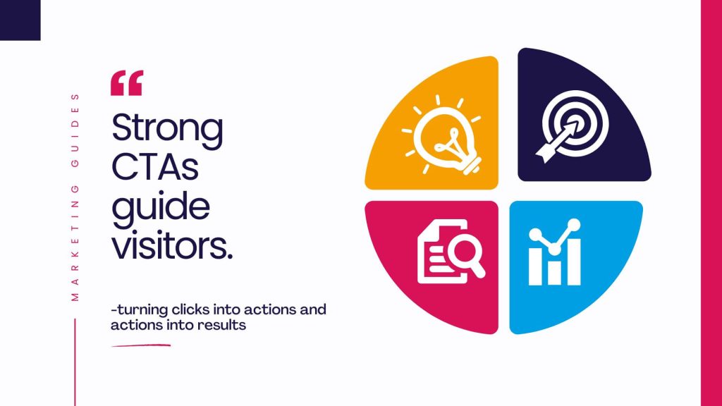
Strong, clear calls-to-action are the unsung heroes of any successful website. They guide your visitors, remove uncertainty, and encourage meaningful action. Without them, even the most beautifully designed site can fall short of its goals. Your website exists to drive results, and clear calls-to-action ensure your visitors know exactly how to take the next step.
Need help optimising your website for conversions? Let’s get started today.
