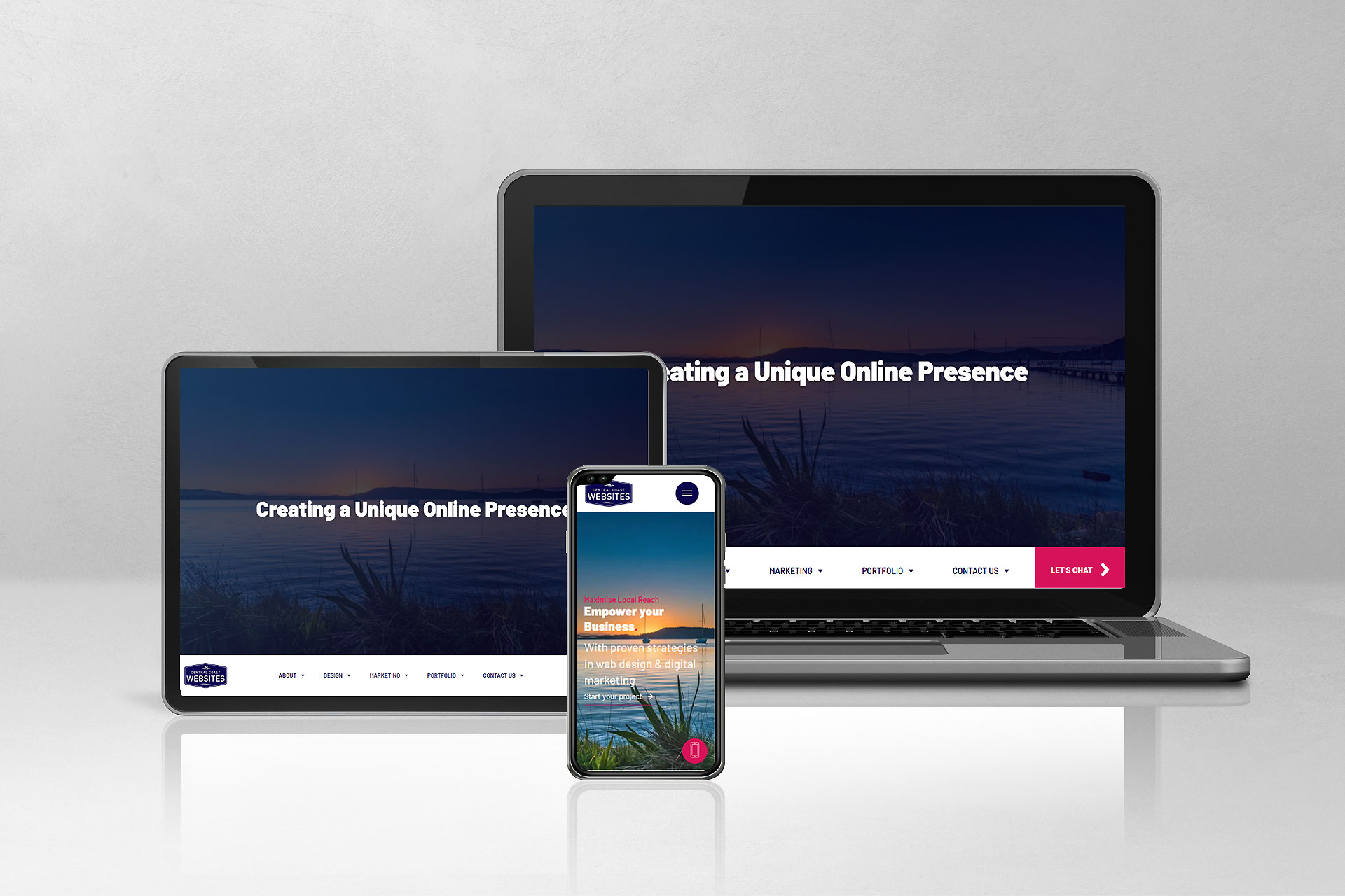
Understanding Breakpoints in Responsive Web Design.
User experience is more important than ever, which means your web design needs to be responsive across all devices, especially with the increasing number of users accessing the internet on smaller mobile phones, tablets or laptops. Responsive web design is essential for delivering a great customer experience, as websites are not just a way to communicate your value proposition—they also influence how potential customers perceive and evaluate your business.
Breakpoints play a crucial role in responsive design by ensuring your website adapts seamlessly across different screen sizes. For more information about creating a responsive website, be sure to check out our page on Responsive Web Design.
With that in mind, let’s look into the concept of breakpoints and explore the common breakpoints used in responsive design.
What are Breakpoints?
Breakpoints in web design are specific screen sizes or resolutions at which the layout of a website adapts to fit the device being used. They are essential in responsive web design, ensuring a seamless user experience across different devices, from smartphones to desktops.
By addressing the challenge of device fragmentation, breakpoints ensure that your website renders consistently and uniformly across all screen sizes, maintaining both functionality and aesthetics on any device.
Device Fragmentation
Device fragmentation refers to the wide variety of devices with different screen sizes, resolutions, operating systems, and hardware capabilities that users may use to access the internet. This diversity makes it challenging for websites and apps to provide a consistent experience across all devices. In web design, addressing device fragmentation means ensuring that a website functions well and looks good on everything from small smartphones to large desktop monitors, which is where concepts like responsive design and breakpoints come into play.
Why Are Breakpoints Important ?
Breakpoints play a crucial role in how your website performs across different devices. They determine the exact points where your website’s layout should change to provide the best possible experience, whether a user is on a small smartphone screen or a large desktop monitor. Understanding the importance of breakpoints can significantly enhance the effectiveness of your responsive design, improve user experience, and ensure your site is optimised for every device. Here’s why breakpoints are so essential in web design:
1. Responsive Design
Breakpoints are a fundamental aspect of responsive design. They allow websites to adjust their layout dynamically, ensuring that content is displayed optimally on any screen size. Whether it’s a compact smartphone or a large desktop monitor, breakpoints make sure that your website is accessible and user-friendly across the board.
2. Improved User Experience
By adapting to different screen sizes, breakpoints enhance the user experience by making it easier to navigate and interact with a website on various devices. A well-designed site with thoughtful breakpoints ensures that users don’t have to pinch, zoom, or scroll excessively, which can be frustrating and lead to a higher bounce rate.
3. Optimisation for Various Devices
Websites with well-defined breakpoints are optimised for specific devices such as smartphones, tablets, and laptops. This optimisation goes beyond just resizing elements; it involves rethinking the layout, navigation, and even the content hierarchy to suit the device, providing the best possible viewing experience for each user.
How to Determine Breakpoints.
Determining the right breakpoints for your website is a key step in creating a responsive design that works well across all devices. The process involves more than just choosing arbitrary points; it requires a thoughtful approach that considers your audience, common screen sizes, and real-world testing. By carefully evaluating these factors, you can establish breakpoints that ensure your website provides an optimal experience for every user. Here’s how to determine the most effective breakpoints:
1. Consider Your Target Audience
Understanding your target audience is crucial when determining breakpoints. Consider the devices they are most likely to use when accessing your website. For example, if your audience primarily uses smartphones, you may need to focus more on mobile breakpoints. On the other hand, if they frequently use tablets or desktops, you’ll need to ensure your site adapts well to those devices too.
2. Research Common Screen Sizes
It’s essential to research popular screen sizes and resolutions when defining breakpoints. Common sizes for mobile devices, tablets, and desktops should guide your decisions, but you should also be aware of emerging trends, such as foldable devices, that may require additional considerations.
3. Testing and Iteration
Testing your website on various devices is a critical step in determining effective breakpoints. Use emulators or physical devices to see how your site responds to different screen sizes. Don’t be afraid to iterate—adjust and refine your breakpoints as needed to ensure the best possible user experience.
Common Breakpoint Values.
While every website is unique, there are standard breakpoint values that are widely used in the industry:
- Mobile: 320px, 360px, 375px, 414px
- Tablet: 768px, 834px, 1024px
- Desktop: 1200px, 1440px, 1920px
These values are starting points, and you may need to customise them based on your website’s specific needs and audience.
Example of a Breakpoint in Action.
Let’s consider a website with a breakpoint at 768px. When the screen width is below 768px, the website might shift to a single-column layout, which is more suitable for smaller screens. This means that elements stack vertically, making them easier to read and navigate on mobile devices. Once the screen width exceeds 768px, the layout could change to a multi-column format, taking advantage of the additional space on larger screens like tablets or desktops.
Additional Considerations for Breakpoints.
When setting breakpoints, it’s important to consider additional factors that can enhance the effectiveness of your responsive design. Simply choosing breakpoints isn’t enough; integrating them with the right layout techniques and content strategies can make a significant difference in how your website performs across devices. By using fluid grids or Flexbox and carefully prioritising content, you can create a more seamless and user-friendly experience. Here are some additional considerations to keep in mind when working with breakpoints:
1. Fluid Grids and Flexbox
Breakpoints work best when combined with fluid grids or Flexbox layouts. These technologies allow for more flexible and adaptable designs that can stretch and contract fluidly as the screen size changes, reducing the need for multiple breakpoints and making the design process smoother.
2. Content Prioritisation
When designing with breakpoints, it’s essential to prioritise content based on the screen size. On smaller screens, you might need to hide or collapse less important elements to keep the user focused on the most critical content. Conversely, on larger screens, you have more space to display additional information or features.
The Role of Breakpoints in Modern Web Design .
Breakpoints are essential for creating responsive, user-friendly websites that adapt to the diverse range of devices used today. By carefully considering your target audience and common screen sizes, you can determine the optimal breakpoints for your website. This ensures that your users have a positive experience, whether they’re browsing on a smartphone, tablet, or desktop. Effective use of breakpoints, combined with modern web design techniques like fluid grids and content prioritisation, can significantly enhance the performance and usability of your website.


